


Some graphic tees reference pop culture. This one captures a moment people still remember.
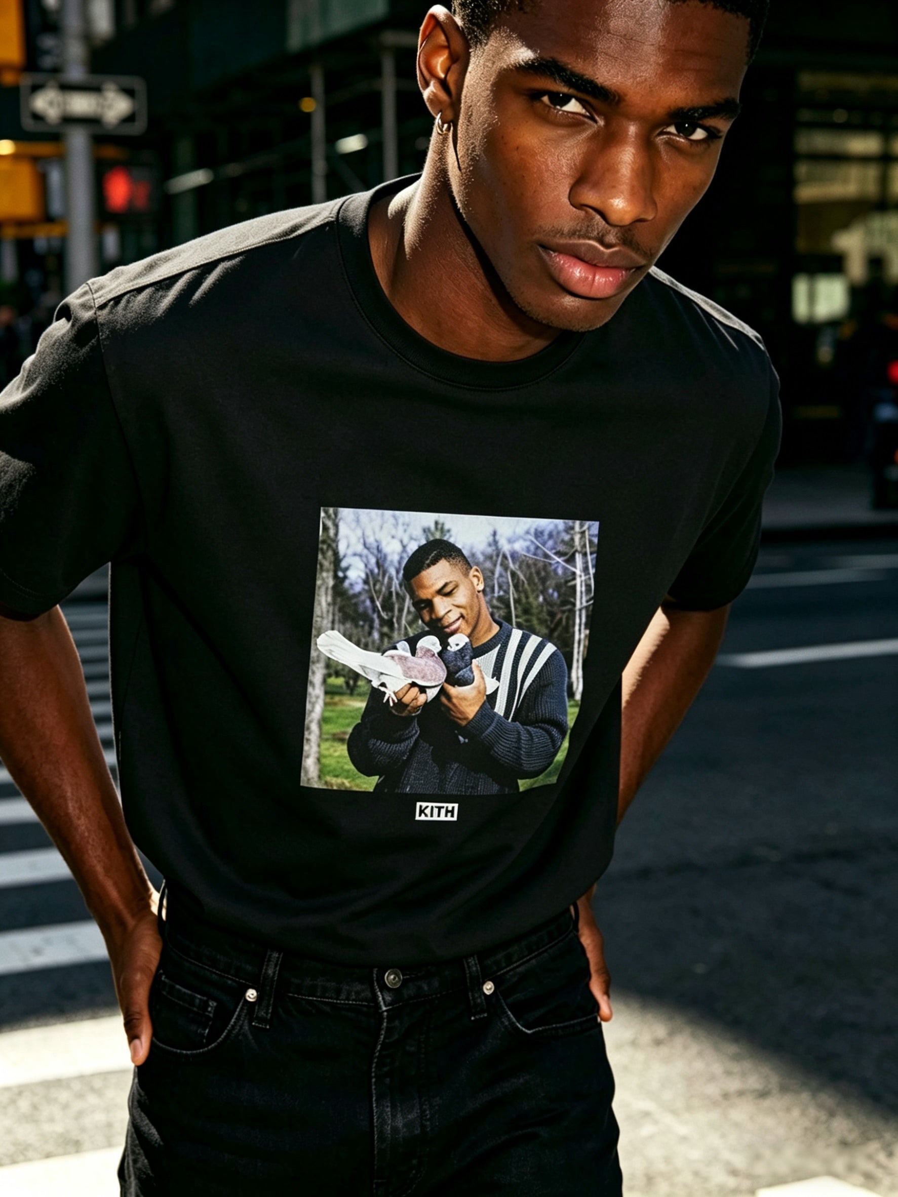
The Kith For Mike Tyson Vintage Tee Black stands out because the image already has a built-in reaction. It is not just a boxer tee. It pulls from the famous Tyson pigeon image that became part of internet culture long after the original photograph. That gives this shirt a different kind of energy. It feels like sports history, meme history, and streetwear graphic language all meeting in one place.
Public product listings consistently describe this style as a black cotton tee with a front graphic, round neck, and short sleeves. Resale and editorial references also tie it to the 2024 Kith release built around the Tyson pigeon image, which helps explain why this tee feels more specific than a generic athlete graphic.
Why the black version hits harder
Black changes the tone of this shirt immediately. A lighter base can make a nostalgic image feel playful. Black gives the same image more weight. It sharpens the contrast, pulls more attention to the front print, and makes the whole piece feel more direct. That matters here because the Tyson visual already has attitude. The darker base lets that attitude come through without needing extra design noise around it.
This is also why the tee works better with simpler outfits than people expect. The image has enough character already. You do not need stacked graphics, loud accessories, or complicated layers. Dark denim, washed cargos, or relaxed shorts are enough. The shirt carries the mood on its own.
Who this tee makes sense for
This one fits buyers who want a graphic tee that says more than “I like vintage sports.” It is better for someone who likes reference-heavy streetwear and wants the reference to feel sharp, not sentimental. The image is recognizable, but the shirt does not read like fan merch. It reads like a piece chosen for the image value itself.
If you like building around graphic-led tops with stronger character, the AFV lineup is a good next stop for the same kind of visual direction.
Fit and sizing thoughts
This type of tee usually looks best when you decide first how much visual room you want around the graphic. If you stay true to size, the print feels more centered and direct. That works well if you want the shirt to sit clean with straight denim or cleaner trousers. If you size up, the image takes on a looser, more casual feel, which can work with wider pants or longer shorts.
The key is not to overdo every part at once. A big graphic on an oversized black tee with very wide pants can flatten the whole outfit. A better move is balance. Keep one side relaxed and let the other stay controlled. That keeps the front image readable and the overall fit intentional.
What makes this graphic different from a standard vintage tee
Most vintage-style tees rely on age effect, washed texture, or faded printing to create interest. This one does not need much help. The source image already does the work. That gives the shirt a more immediate presence. It is less about simulated nostalgia and more about choosing one culturally loaded image and letting it speak clearly.
That difference matters in real wear. You can throw this on with plain black pants and still have a complete look. You can also break up the darkness with lighter shoes or a muted overshirt if you want the print to feel framed rather than fully dominant. Either way, the shirt gives you a starting point fast.
Two styling routes that suit this tee
The first route is all about tonal depth. Pair it with washed black denim, darker sneakers, and one silver accessory. This keeps the outfit tight and lets the Tyson image become the strongest break in the look. It feels direct, urban, and a little more serious.
The second route is contrast through texture. Wear it with olive cargos or vintage blue denim, then add a simple zip hoodie or a light overshirt left open. That keeps the shirt from feeling too heavy, while the black base still anchors everything underneath. This route works especially well when you want the tee to lead, but not overpower the full outfit.
Why this tee has better staying power
A lot of collaboration tees spike because of name value and disappear because the graphic is too one-note. This one has more repeat-wear potential because the image is unusual enough to stay interesting, while the black base keeps it easy to place inside normal streetwear outfits. That balance is hard to get right. Here, it is the reason the piece feels worth revisiting after the initial release buzz.
Release coverage and marketplace listings also align on the basic launch window and black colorway, which supports that this was positioned as a focused graphic drop rather than a broad basics item.
Care and long-term wear
For a black cotton graphic tee like this, washing inside out and avoiding harsher heat will usually help the print and surface stay cleaner over time. General cotton care guidance also recommends gentler washing and lower drying heat when possible. See CottonWorks for broader cotton-care guidance.
Final word
The Kith For Mike Tyson Vintage Tee Black works best for someone who wants a graphic tee with real image authority, not just a familiar logo or a generic sports reference. The black base gives the front print more force, and the Tyson image gives the shirt a point of view fast. If your wardrobe already leans toward darker bottoms, restrained layers, and statement tees that do the talking, the Kith For Mike Tyson Vintage Tee Black fits that rotation naturally.
Share:
Fear of God Essentials Essentials Shorts Iron — Soft Weight, Quiet Utility
Kith For Nanzuka Gallery Sorayama Model A Stitch Tee Black — Mechanical Art, Dark Frame