


Stussy Shattered Tee White and Stussy Shattered Tee Black work best when you stop treating them like the same tee in two colors. The graphic is shared, but the role each one plays is different. That difference matters because most buyers are not really choosing between a white shirt and a black shirt. They are choosing between two kinds of outfit energy. One opens up a look. The other grounds it. That is what makes this pair worth discussing together.
Why this graphic works in both colors
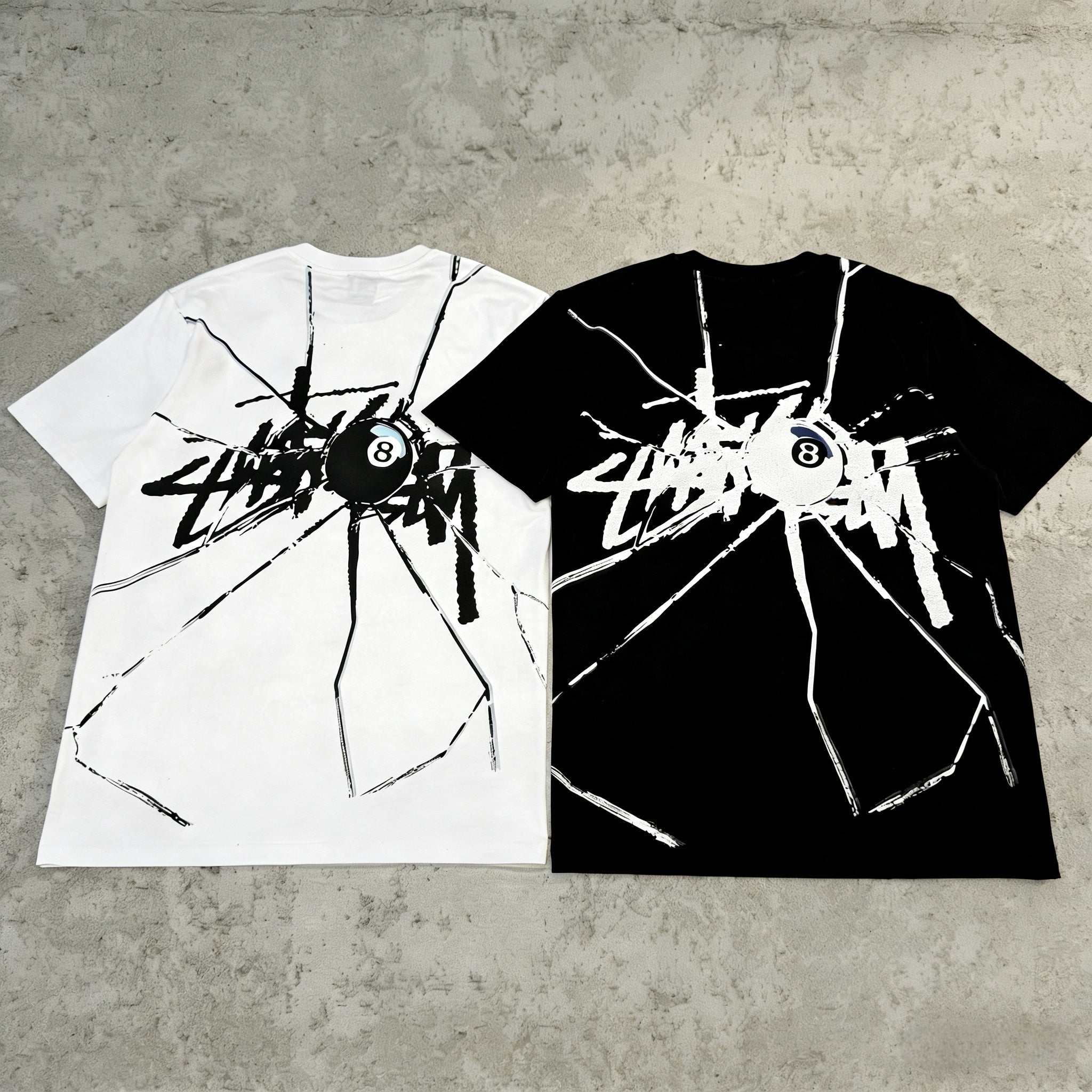
The Shattered design has enough movement to give a simple tee real character. It does not depend on oversized text alone. It feels more broken up, more textured, and more active across the shirt. That gives both versions an advantage over a plain logo tee. They still feel easy to wear, but they do more for the outfit. If your closet already has enough simple Stussy basics, this graphic gives you a way to change the mood without leaving the brand’s lane. For buyers comparing similar pieces, the Stussy collection is the easiest place to check how different graphics sit next to cleaner staples.
What the White version brings to a wardrobe
Stussy Shattered Tee White gives the artwork a cleaner field to work on. The print feels more separated from the base, so the design reads with more light and more visual space. That makes the shirt feel open, fresh, and easy in daytime outfits. It works especially well with washed denim, stone cargos, faded olive shorts, and lighter outerwear. If your style leans into neutral layers, sun-faded tones, or softer summer colors, the white version fits in without effort.
There is also a practical styling benefit to white. It can break up darker outfits and stop them from feeling too dense. A black zip hoodie, charcoal pants, and simple sneakers can look lighter and more complete once a white graphic tee sits underneath. That makes this version useful even if your wardrobe is not especially light overall. It adds contrast without becoming too loud. The graphic has enough attitude to carry the shirt, but the base color keeps the whole thing approachable.
Another advantage is how the white tee supports warmer-weather dressing. It looks natural with relaxed shorts, easy denim, and low-profile footwear. It can stay as the main visible piece, or it can sit under an open overshirt and still keep the outfit feeling airy. That range matters because some graphic tees feel strong on day one but hard to repeat later. This one avoids that trap by staying bright, simple, and easy to rotate.
What the Black version adds instead
Stussy Shattered Tee Black takes the same design and gives it more weight. The graphic feels denser and more direct on a dark base. That gives the shirt a steadier presence in the outfit. Instead of opening a look, it helps anchor one. With black cargos, washed charcoal denim, darker shorts, or faded olive pants, the black version feels smooth and settled. It does not need much help from the rest of the outfit. It already brings enough depth on its own.
That makes the black tee especially useful for buyers who dress around darker palettes. If most of your closet lives in black, navy, charcoal, brown, or muted green, this version blends in naturally while still giving you graphic interest. It can sit under outerwear without feeling too sharp, and it does not interrupt the rest of the outfit with a strong color break. That is a real strength for cooler months or for anyone who prefers a more grounded streetwear look.
The black version also handles repeated wear in its own way. It feels easy with heavier shoes, washed jackets, and darker layering pieces. You can wear it with minimal thought and still get enough visual texture from the print. That makes it useful for buyers who want a graphic tee that feels integrated rather than spotlighted. It is still expressive, but the expression comes through depth and control instead of brightness.
How both versions handle fit and shape
The best thing you can do for either color is give the graphic enough room to sit cleanly. A relaxed fit usually makes more sense than a tight one. The White version benefits because the artwork keeps its spacing and clarity. The Black version benefits because the visual weight feels more balanced on a roomier body. In both cases, true to size is usually the safest move if you want the familiar Stussy tee shape. Sizing down can work, but part of the appeal comes from letting the print breathe.
That fit choice also changes the way each color moves with the rest of the wardrobe. A slightly roomier white tee feels easy with loose denim and casual shorts. A roomier black tee feels strong under outerwear and with more structured pants. The colors are doing different work, but both need enough shape to show it properly. That is why this is not just a color question. It is also a proportion question.
Why both deserve a place in rotation
Stussy Shattered Tee White earns its spot through contrast, brightness, and the ability to freshen simple outfits. It works well when you want the graphic to stand a little farther forward while the rest of the look stays relaxed. Stussy Shattered Tee Black earns its place through depth, steadiness, and easy integration with darker styling. It works well when you want a graphic tee that feels natural with outerwear, denser colors, and repeated daily wear.
That is what makes this pair interesting. The White version is not trying to do the same job as the Black version. One helps lighten and separate an outfit. The other helps ground and connect one. Both stay wearable because the Shattered graphic gives enough movement without making either tee feel forced. If you want the official brand context for how Stüssy frames tees as a category, the official tees page shows the label’s mix of basic logos and seasonal graphics. In real wardrobe terms, though, these two colors succeed because each one brings its own reason to wear it again.
Share:
Stussy Graphic Tees Black and White — Four-Way Graphic Mood Guide
BAPE Graphic Tee Edit — Check Neutrals and Color Camo Contrast